In a workplace known for happiness, the support experience wasn’t part of the joy.
Unhappy employees raised multiple escalations everyday, while VMware lost money on expensive and overloaded phone support.
I was a part of the team that was given a bold challenge to “Make internal support as delightful as everything else here.”
- Service Design Strategy
- User Research
- Mobile PWA Strategy
- Prototyping
Product Overview
HelpNow+ is an omnichannel internal support platform designed to consolidate IT, HR, and Workplace services into a single, intuitive experience for 40,000+ employees.
Challenge
To replace a generic ITSM tool forcing employees into complex forms with a delightful, consumer-grade experience, reducing the heavy reliance on phone support.
Constraints
Strict SLAs (incident capture < 6s), limited backend customization to ensure upgrade compatibility, and diverse stakeholder requirements across IT, HR, and Finance.
Success Metrics
- 40% reduction in support tickets in year 1
- 94% CSAT score from employees
- 91% overall satisfaction rate (n=178)
Design Impact
- Restored trust through "Private Mode" and transparency
- Empowered workforce with Mobile PWA for 24/7 access
- Shifted culture from reactive tickets to proactive self-service
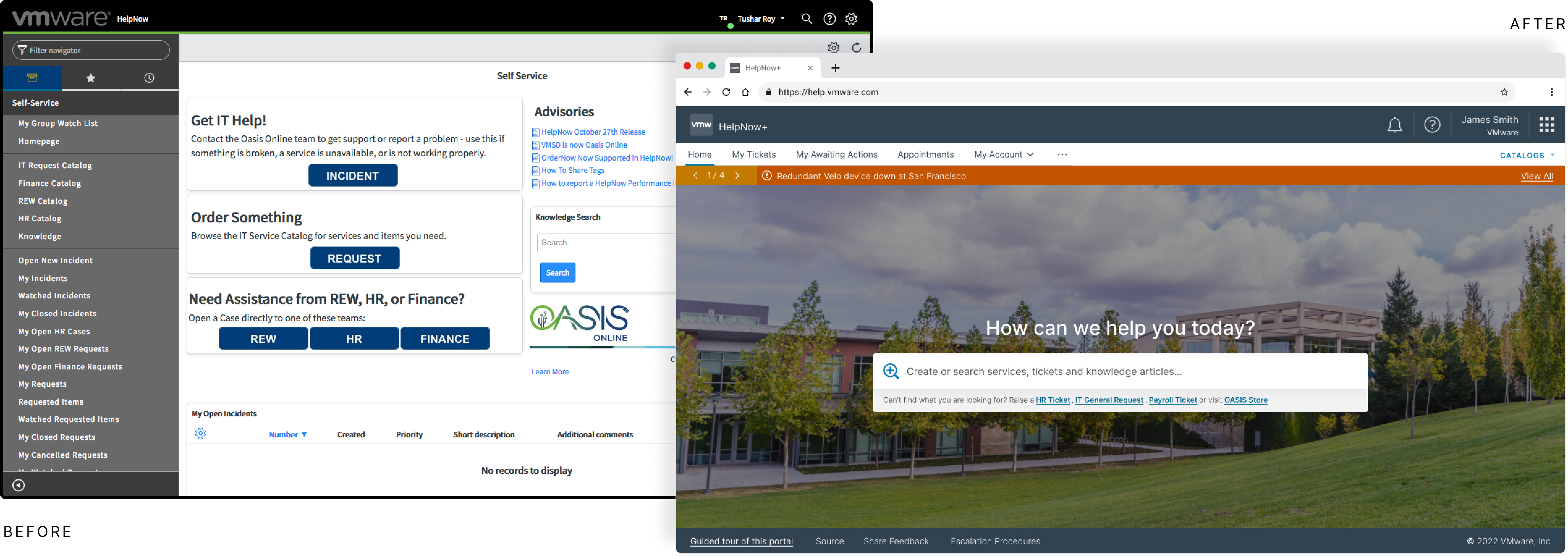
ITSM pretending to be an Employee Portal
Built for IT
The existing system, an IT Service Management (ITSM) tool, was force fitted for a geo-diverse rapidly growing organization.
- Non IT teams (HR, Finance, Real Estate & Workplace etc) felt like second-class citizens.
- 84% survey participants used phone service to emails to report non-IT issues.
Navigation Friction & Hidden Costs
My initial Heuristic Evaluation revealed that Navigation Overload was driving up operational costs. Interviewing over a dozen employees, I found:
- Cognitive Load: Casual users spent over 2 minutes navigating complexity.
- System Abuse: Power users were bypassing correct channels to use generic 'Incident Forms,' creating a 'false path' that required manual triage.
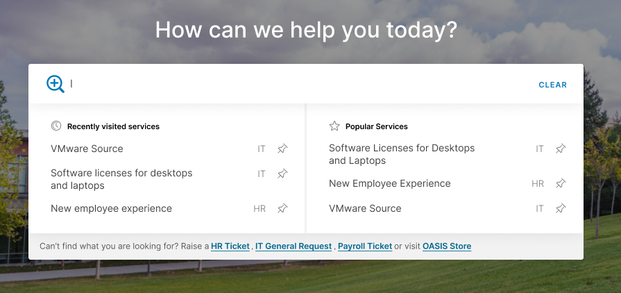
Radical Simplification
We hypothesized that a Search-First paradigm (powered by NLP and Elastic Search) would reduce friction. We pushed for Radical Simplification, effectively removing the browsing interface to rely entirely on intent detection.
- Engineering POC of NLP driven elastic-search was our first success party moment!
- Google-like minimalistic UI was considered the safest and best approach.
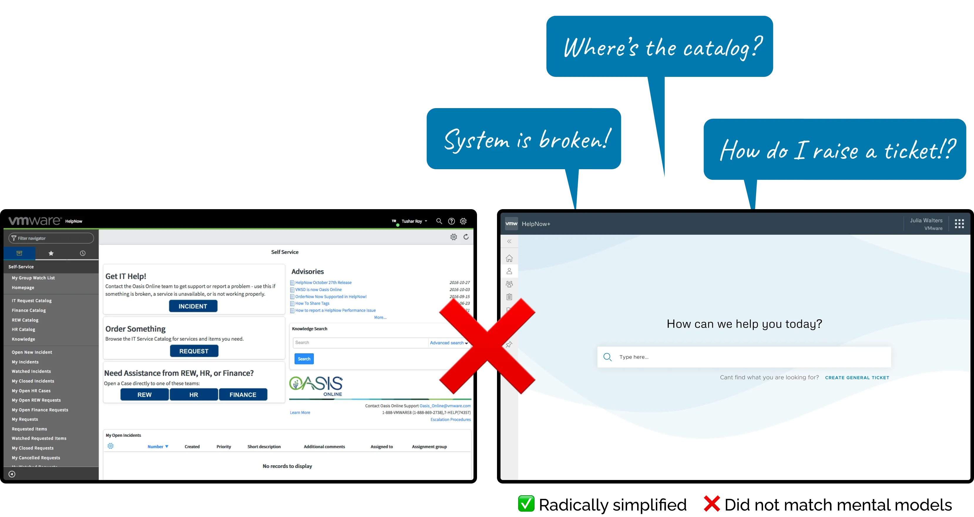
Design Trade-off
- For important services (like IT incidents & HR complaints) we had to expose dedicated shortcuts to support department-specific constraints.
Early ‘Oh’ moment in the design
The design failed Jakob’s Law. Users rely on Recognition over Recall. Removing the service catalog confused users and they felt lost.
Contextual Relevance
We recognized that efficiency requires a balance between Discovery and Speed. We had to bring a Hybrid Navigation Model:
- Restored Affordance: We reintroduced the Service Catalog to ground the user's mental model and provide 'Information Scent.'
- Predictive Accelerators: Instead of forcing search, we added Smart Shortcuts (Recent Searches, Most Used, Pins). This effectively personalized the dashboard, turning distinct user behaviors into fast-access paths without cluttering the global interface.
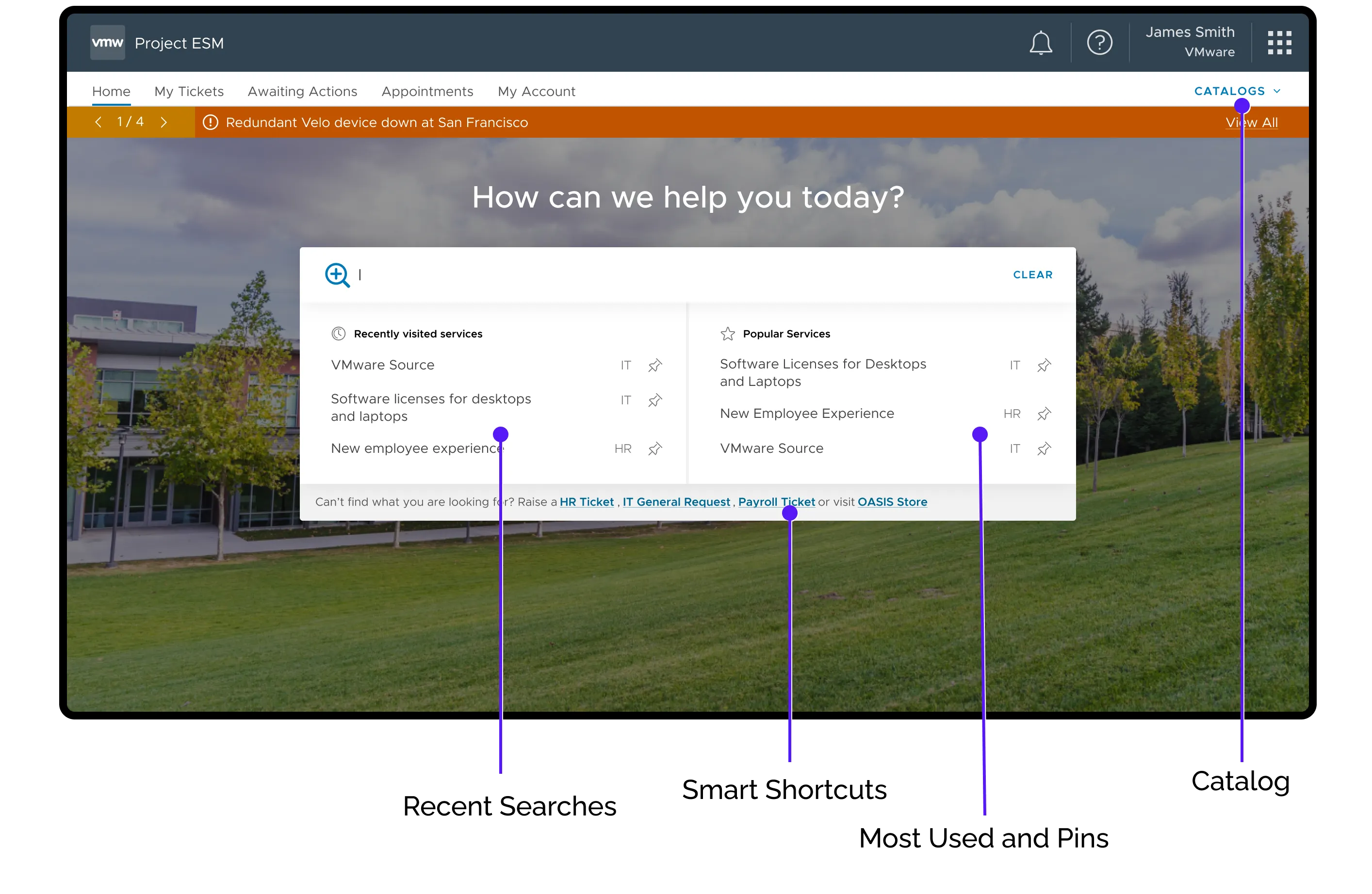
Final Homepage Experience
Designing for Psychological Safety
The ChallengeSystemic Avoidance
My research uncovered a critical barrier to adoption: Lack of Trust. 10 out of 12 interviewees admitted they bypassed the portal for sensitive HR requests. Without visible privacy controls, employees defaulted to calling agents or emailing directly. This overloaded the support agents, slowed responses, and in turn caused escalations, turning it into a vicious cycle.
The SolutionVisibility & Agency
We decided to moved privacy and accountability from backend policies to First-Class UI Elements.
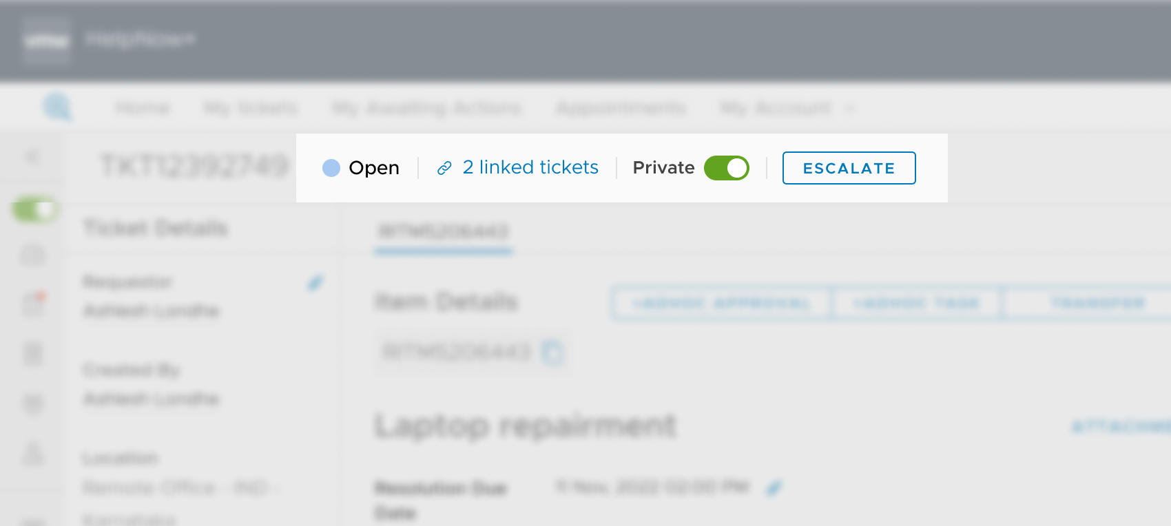
- User-Controlled Visibility:We introduced an explicit "Private Mode" Toggle. By giving users granular control over who sees their ticket before they submit it, we reduced the anxiety of reporting sensitive issues.
- Operational Accountability:We replaced the feeling of helplessness with agency by adding a direct "Escalate" Action. This served as a psychological safety net—users knew that if the system stalled, they had a "break glass" mechanism to get attention, eliminating the need to preemptively escalate via email.
Turning ‘good-to-have’ to a major use case
ChallengeLack of support on the go
The legacy system did not work on mobile screens. My designs were responsive (as a standard practice), but using native features like camera and voice became one of the most useful and delightful experience.
Reducing Barriers to Entry: The PWA Strategy.
We bypassed the App Store friction by deploying a Progressive Web App (PWA). This allowed us to leverage native hardware (Camera for barcode scanning) without the high Interaction Cost of installation.
Prioritizing Speed of Resolution over Speed of Submission
We strategically 'shifted left' the categorization process. By replacing the generic open text field with a structured service catalog, we empowered users to self-triage. This effectively distributed the routing workload and prevented the Help Desk from becoming a Single Point of Failure (SPOF).
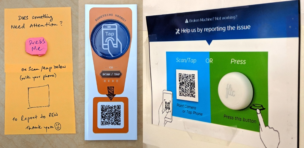
Contextual Support at the Point of Need
We moved beyond the screen to establish a Presence-Based Support Model. By embedding physical triggers (IoT buttons, NFC tags) directly into the office environment, we reduced the friction of 'finding help' to near zero.
"Overnight, 40,000+ employees had multiple channels to request, and stay on top of their issues at work."Impact
The Game Changer
Encouraging whats next
The success of HelpNow demonstrated to leadership that a superior support experience not only cuts costs, but also reinforces our "Best Place to Work" culture.
This earned us the green light to build a brand-new service management backend from scratch, which we later spun out as a commercial offering.
LearningsWhat This Taught Me
-
Design for Safety
Psychological safety dictates usage; give users granular control over their information visibility early on.
-
Balance Discovery & Speed
Radical simplification without familiar grounding elements (like a service catalog) frustrates expert users.
-
PWA is an Enabler
Lowering the barrier of entry by avoiding app stores makes internal tech adoption seamless.