Case Study 01 // Vanguard

Making Security Work Measurable

The InfoSec organization at Apple struggled to answer one question: "How are we keeping Apple safe?".

I led design for a self-service analytics platform that answered it through coverage and on-time commentary on metrics. The platform simplified metric management and paired AI-generated insights with human validation. Security leaders used it to plan efforts, investments, and priorities with confidence.
Vanguard Homepage Interface - Executive Security Health Overview
Vanguard: Central executive dashboard displaying governed security metrics with live trust tiers and anomaly alerts.
role

Lead Product Designer

Strategy, interaction model, governance design.

-
team

Core & Partner Teams

1 Designer (me), 4 Developers, 2 Data engineers, 1 PM, 1 SME, partner security orgs.

outcome

30% → 75%

Escalation calls during incidents cut by more than half. Onboarding dropped from 2 months → 5 days.
context

Vanguard Business Intelligence (BI)

The BI team's charter was to publish performance metrics for senior leadership and partner teams to help make strategic, forward-looking decisions.

They closely worked with each partner team to hand-build metrics - defining the measure, negotiating the formula, working with multiple data engineering teams, publishing, and handling ongoing maintenance.

Metrics published in Vanguard were the single source of trusted truth for Apple leadership.

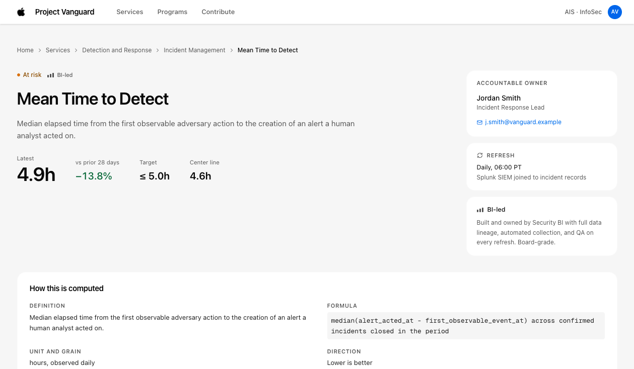
Mean Time to Detect (MTTD) Metric View
Single Metric Detail View (MTTD)
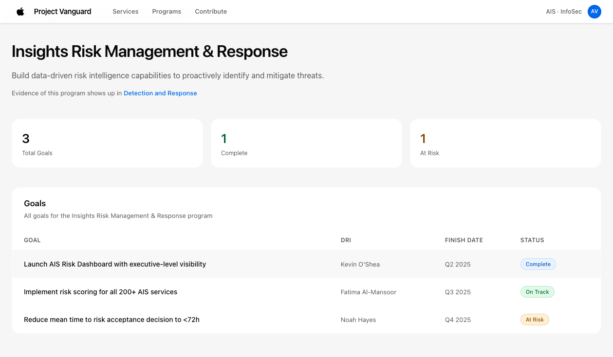
Vanguard Security Programs Inventory
Vanguard Security Programs Catalog
Early Vanguard metrics and program structures were manually maintained by a central BI squad.
problem

Executives had no defensible way to answer ‘How are we keeping Apple safe?’

The small BI team could only cover ~30% of the security teams. Others ended up creating their own dashboards to share with leadership directly. Executives were struggling for one holistic view they could trust.

My Design Goals:
  • Increase BI coverage - through simplified or faster onboarding.
  • Design and implement a holistic view for leadership - using a top-down results map.
  • Improve the platform interface - to better the dashboards of non-BI teams.
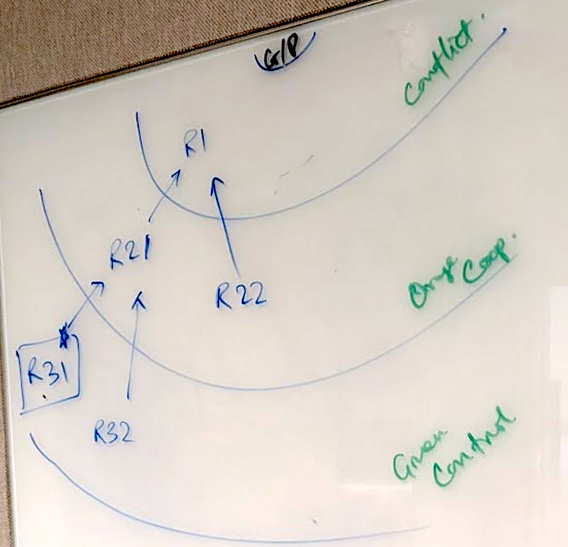
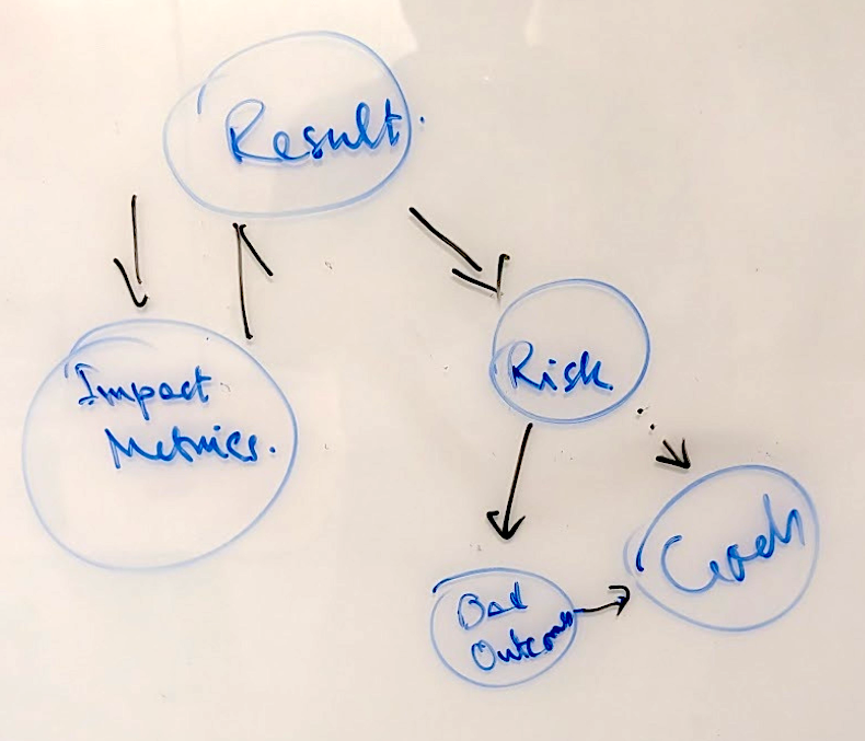
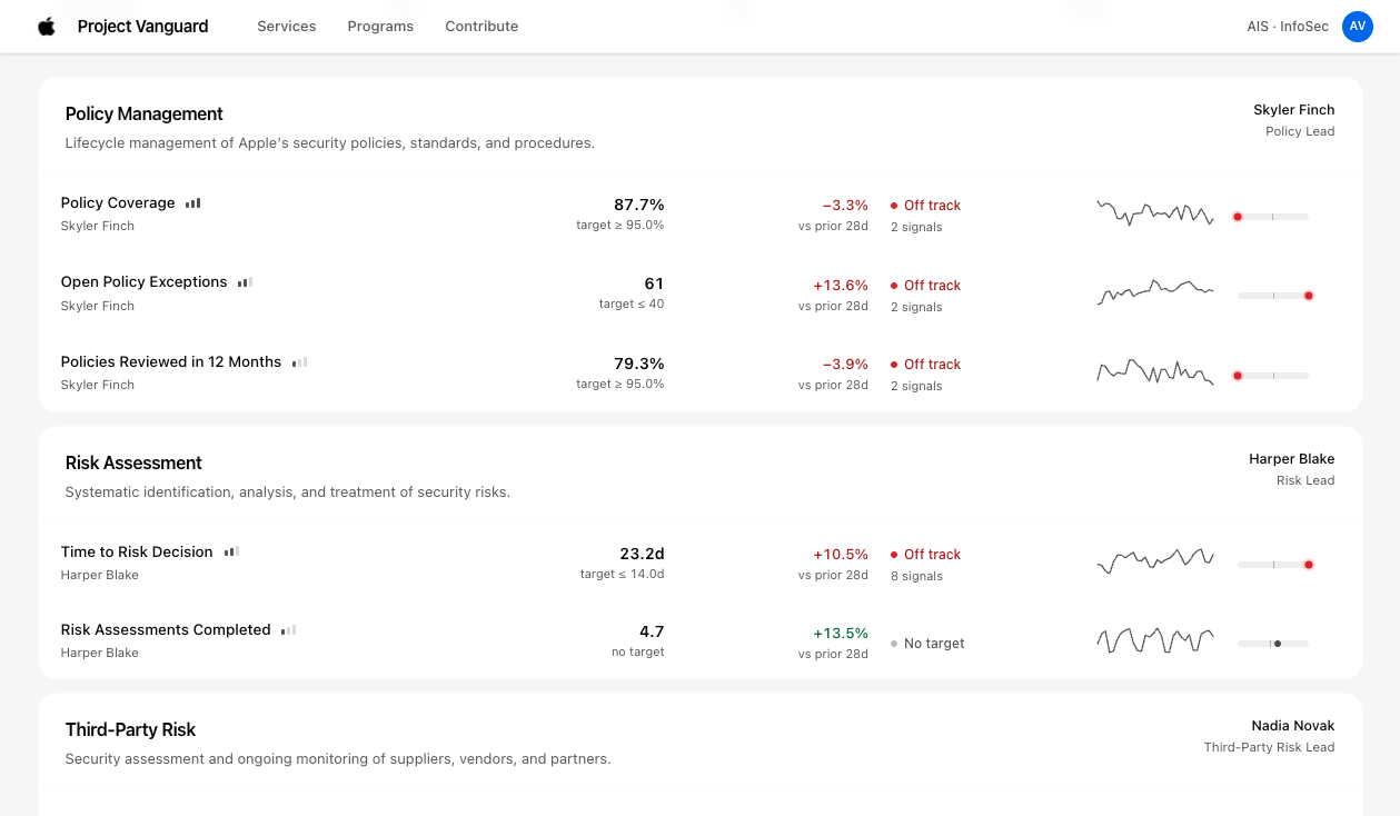
Top-down Results Map for Leadership
Holistic leadership view: mapping strategic goals to measures
Impact Metrics Breakdown
High-level security impact metrics
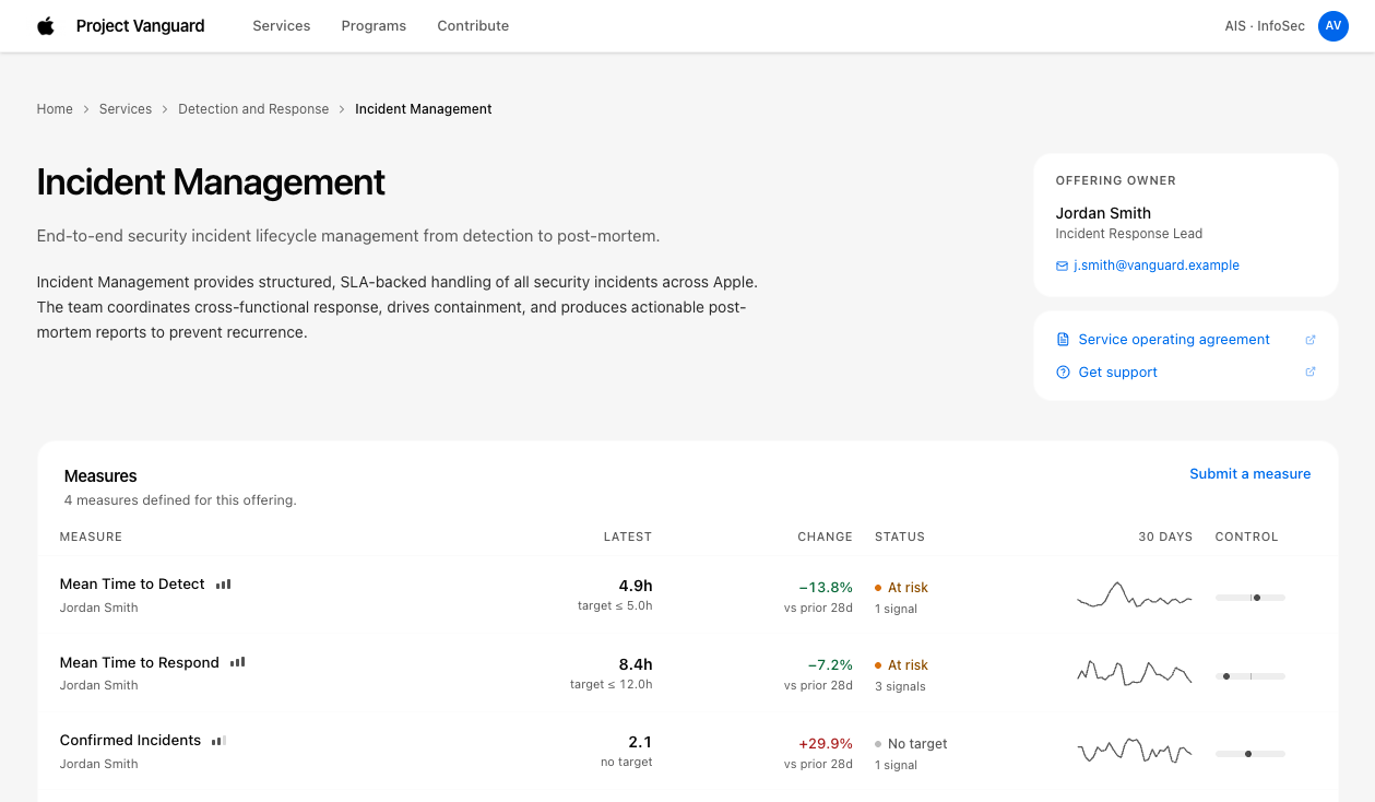
Incident Management Dashboard
Non-BI team dashboard integration
Connecting top-level strategic security objectives to team-level operational metrics.
research

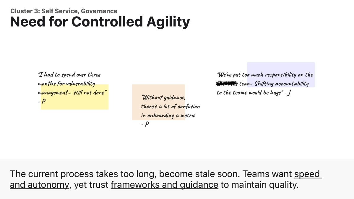
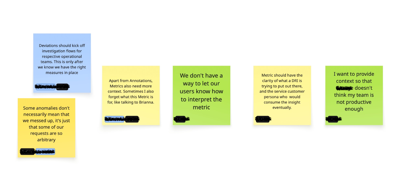
Metrics went stale, and anomalies unexplained

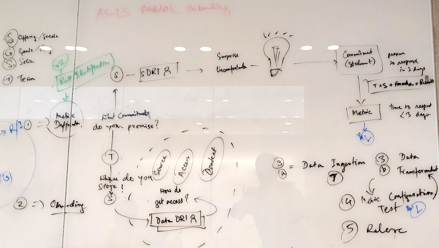
I started with a design sprint with the BI team to align on goals and map how a metric actually gets made. Then I ran interviews on both ends of the pipe.

I found onboarding was slow (average 2 months) primarily due to iteration between the two teams. Also, different teams had a variety of dashboards - using varied metrics across the board.

My conversations with partner teams and executives uncovered two underlying challenges:

1. Published metrics went stale soon

Teams had to spend a lot of time continuously working with the BI team to maintain their metrics, and back-and-forth caused more friction than help.

2. Anomalies were displayed, but not explained

When a metric spiked, there was a flurry of questions, check-ins, and chaos as leadership wanted to understand the full picture.

Research Findings: Onboarding Friction and Maintenance Choke Points
Mapping the metric authoring lifecycle and identifying failure points
Metric Workflow and Back-and-Forth Handoff Friction
The 2-month handoff bottleneck between partner teams and central BI
Visualizing the iterative bottlenecks that made central metrics lag operational realities.
strategy

The team had two plans. I argued for one.

Main points from the Design Sprint Debate:

Director
"More BI headcount cannot solve the bottleneck problem, since teams are looking for autonomy and control."

Me, Director, Dev Lead

"Let's expand to a self-service platform, AI-powered anomaly detection and analysis."
Product Manager
"That will dilute the trust factor we gained over years."

The Fundamental Question:

"If anyone can publish, why would an executive believe anything?"

Reframed Design Challenge:

"How might we make governance and trust signals visible in a scalable business intelligence platform?"
Strategic Architecture: Governance and Trust Model
Architectural framework for self-service with embedded governance
Governing Trust Signals in a Scalable BI Platform
Detailed interaction model mapping trust tiers directly into user workflows
Strategy: Moving from gatekeeper reviews to visible, embedded provenance signals.
design

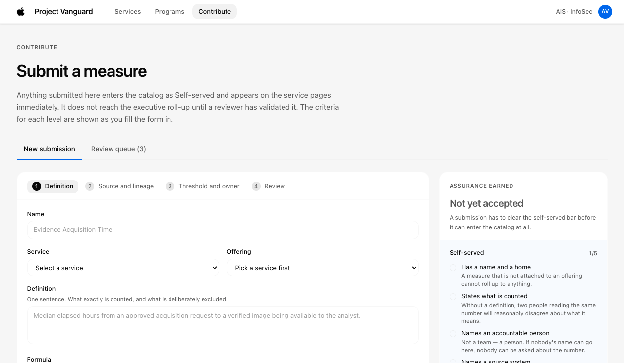
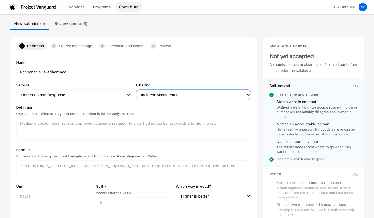
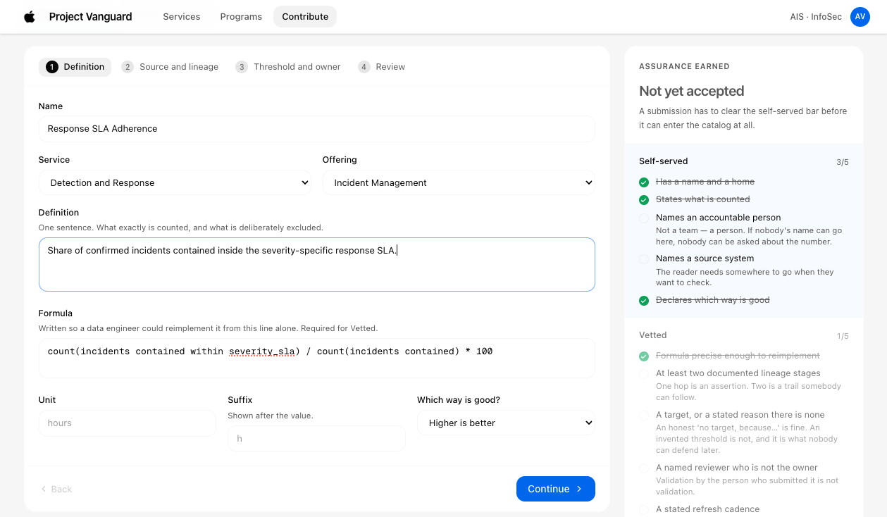
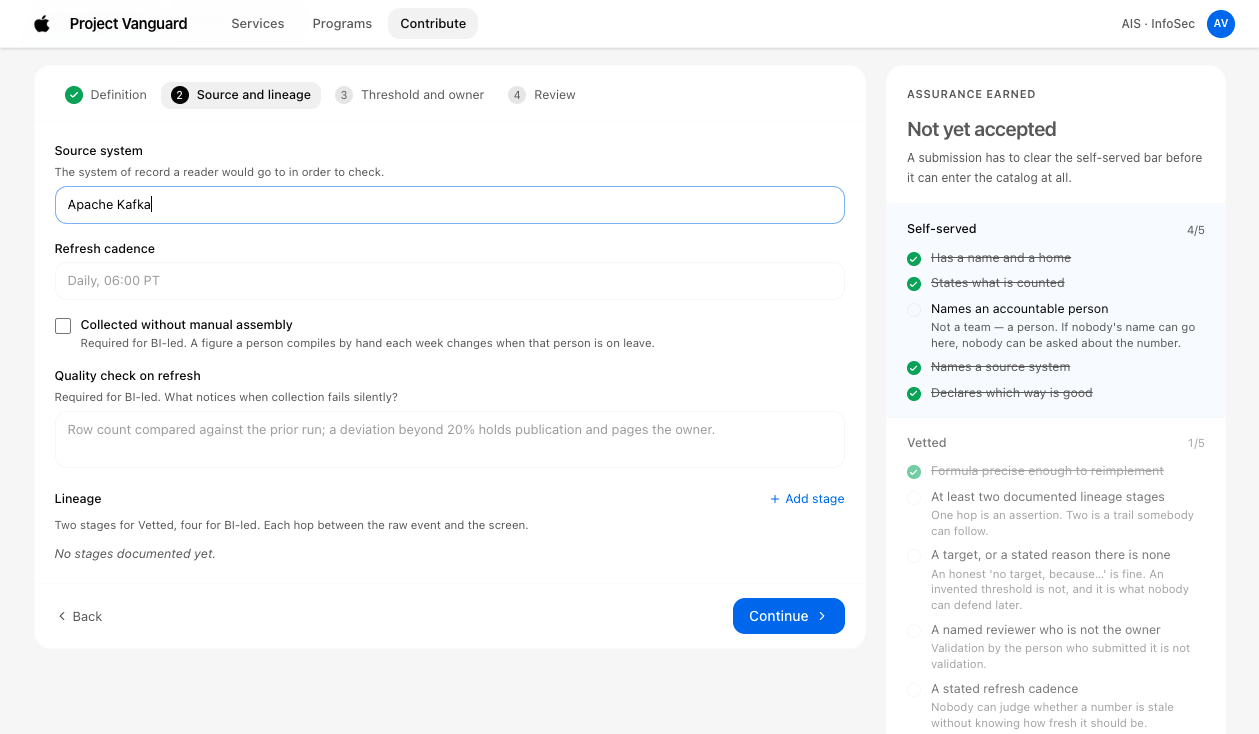
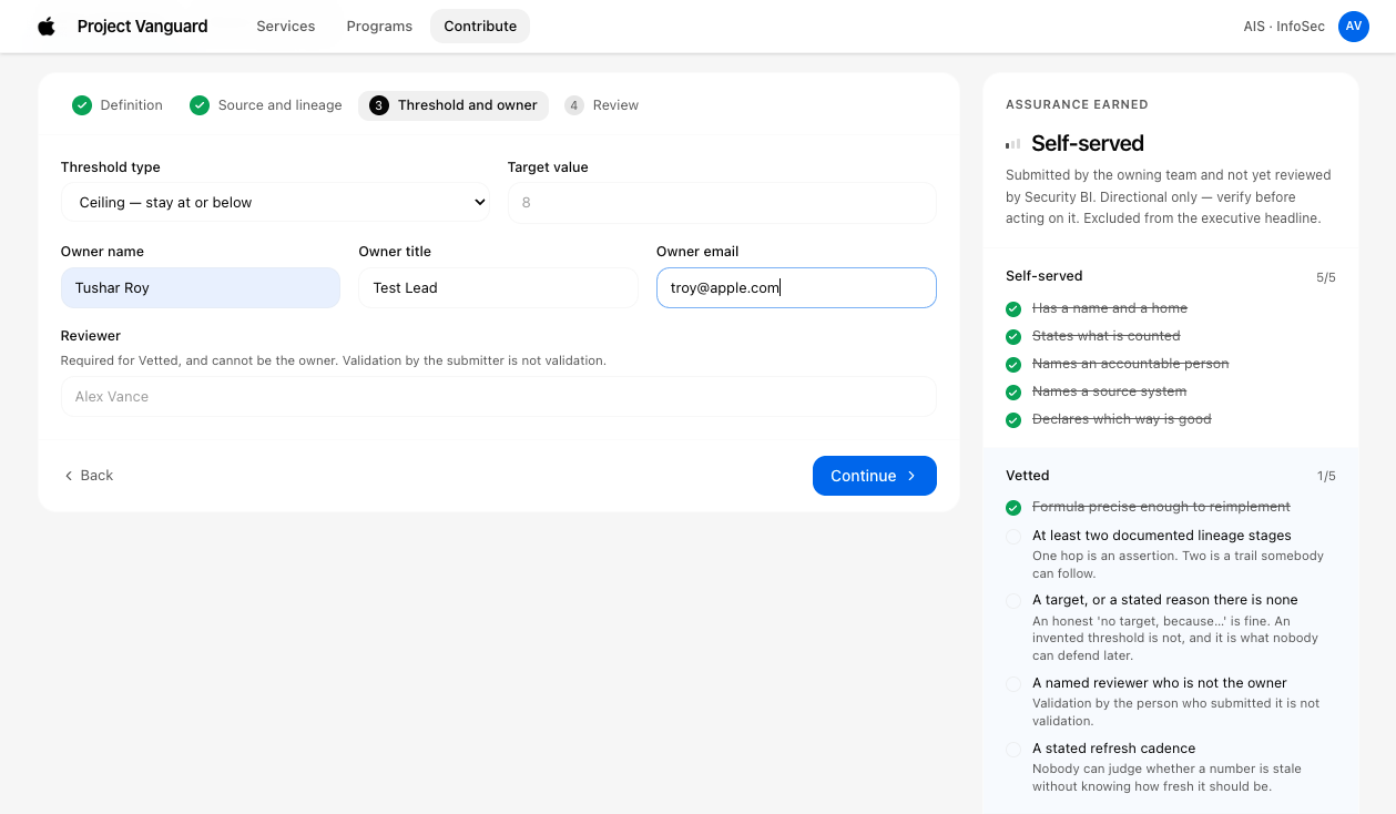
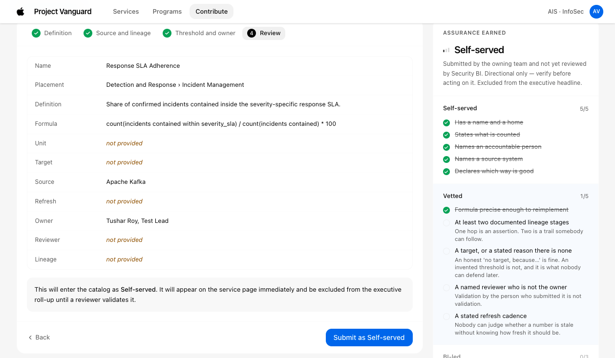
1. Quality gates built into the onboarding flow

Rather than reviewing quality after submission, I baked checks directly into the authoring path. The self-serve flow asks the same questions the BI team used to ask in review meetings:

CHECK 01

Formula Clarity

Is there an explicit, unambiguous formula for this measure?

CHECK 02

Data Provenance

Are all contributing data sources declared?

CHECK 03

Baseline Calibration

What does "good" look like, and against what baseline?

Step 1: Formula definition and verification
01. Measure — Partner teams define measures with clear formulas and data sources.
Step 2: Baseline targets and anomaly limits
02. Thresholds — Baseline calibration sets statistical control limits and alert bands.
Step 3: Direct Responsible Individual (DRI) assignment
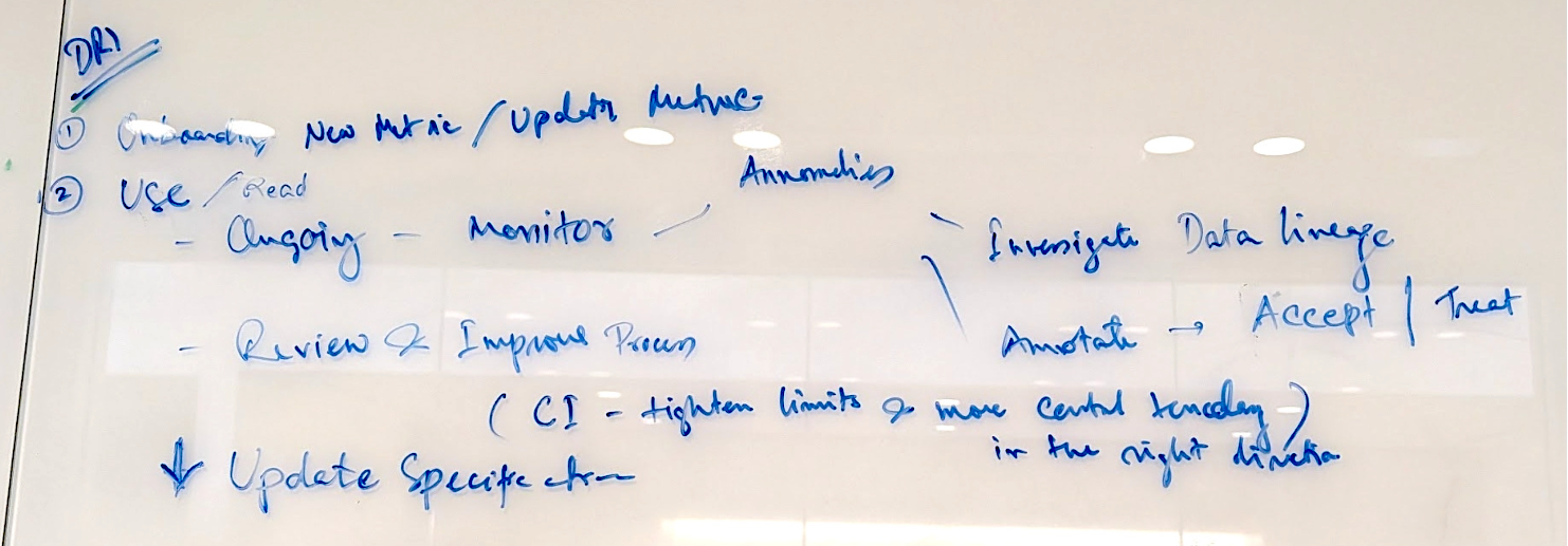
03. Ownership — Every metric requires a named DRI responsible for investigations.
Step 4: Continuous data pipeline validation
04. Automation — Continuous queries poll endpoints to ensure zero data drift.
Step 5: Change history and version logging
05. Audit Trail — Formula revisions and pipeline edits are immutably versioned.
Step 6: Metric sign-off and publication
06. Certification — Automated verification qualifies the metric for live executive surfaces.
Steps 1 through 6 of the governed onboarding flow. Checks happen automatically as authors configure each metric.
design

2. Always-attached trust tiers and data lineage

We started with Gold / Silver / Bronze states, but initial tests revealed attitudinal biases - lower tiers felt like something to hide, as opposed to a step to climb.

We changed it to actual state which describes the provenance instead of status.

Tier Governance Meaning Author SLA
BI Led Defined, built, and maintained by the central BI team. Meets full enterprise standards. Central BI Squad 99.9%
BI Approved Built by owning team, reviewed and signed off by BI. Quality gates verified. Partner Team + BI Review 99.5%
Self-Service Built and published autonomously by owning team. Clear lineage badge attached. Partner Team Autonomous Best Effort
Trust Tiers Interface showing BI-Led, BI-Approved, and Self-Service Badges
Trust tier badges displayed contextually across dashboards
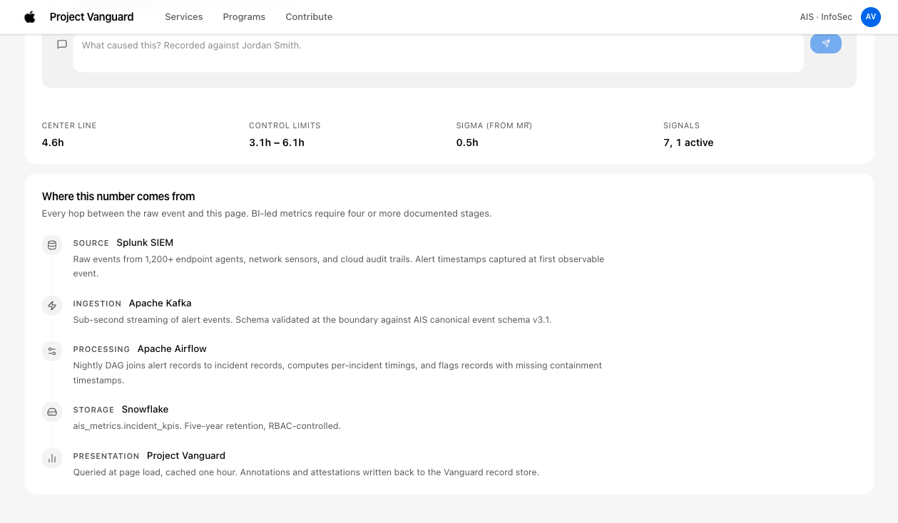
MTTD Anomaly Data Lineage Explorer
Interactive data lineage explorer tracing raw telemetry sources
Provenance, not status. Viewers evaluate confidence based on concrete data lineage rather than subjective rating.
design

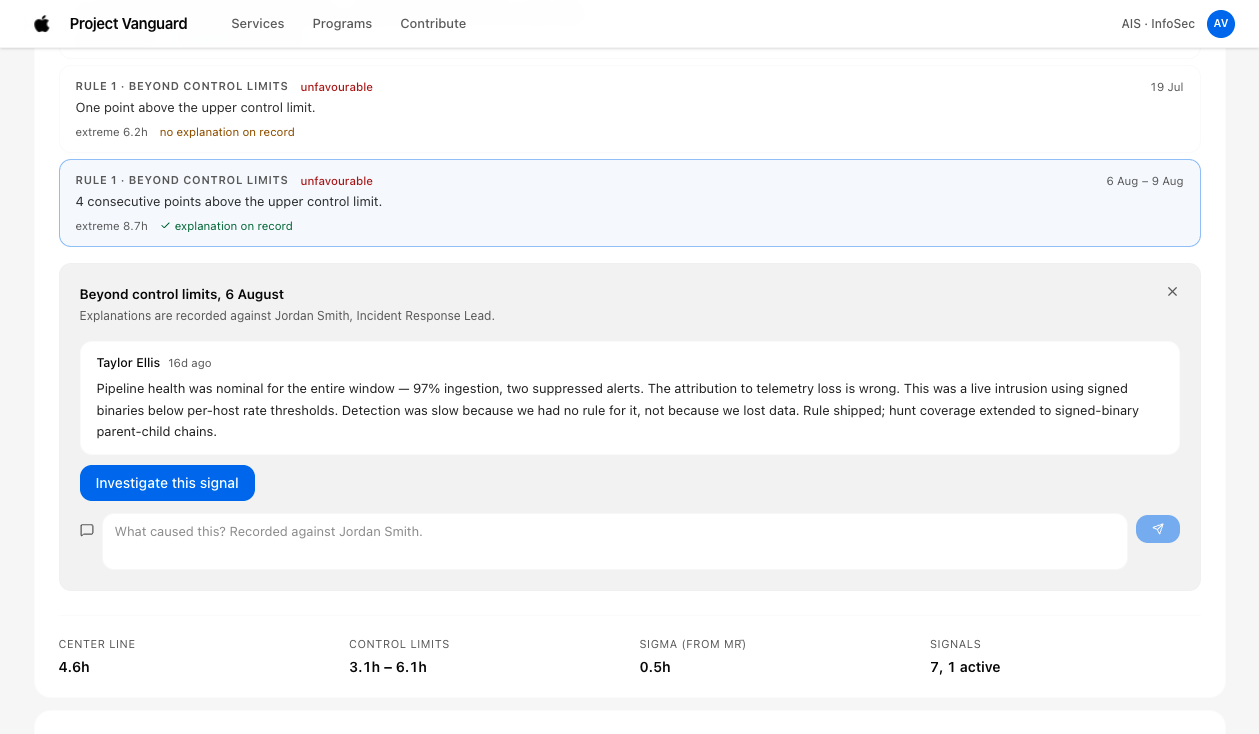
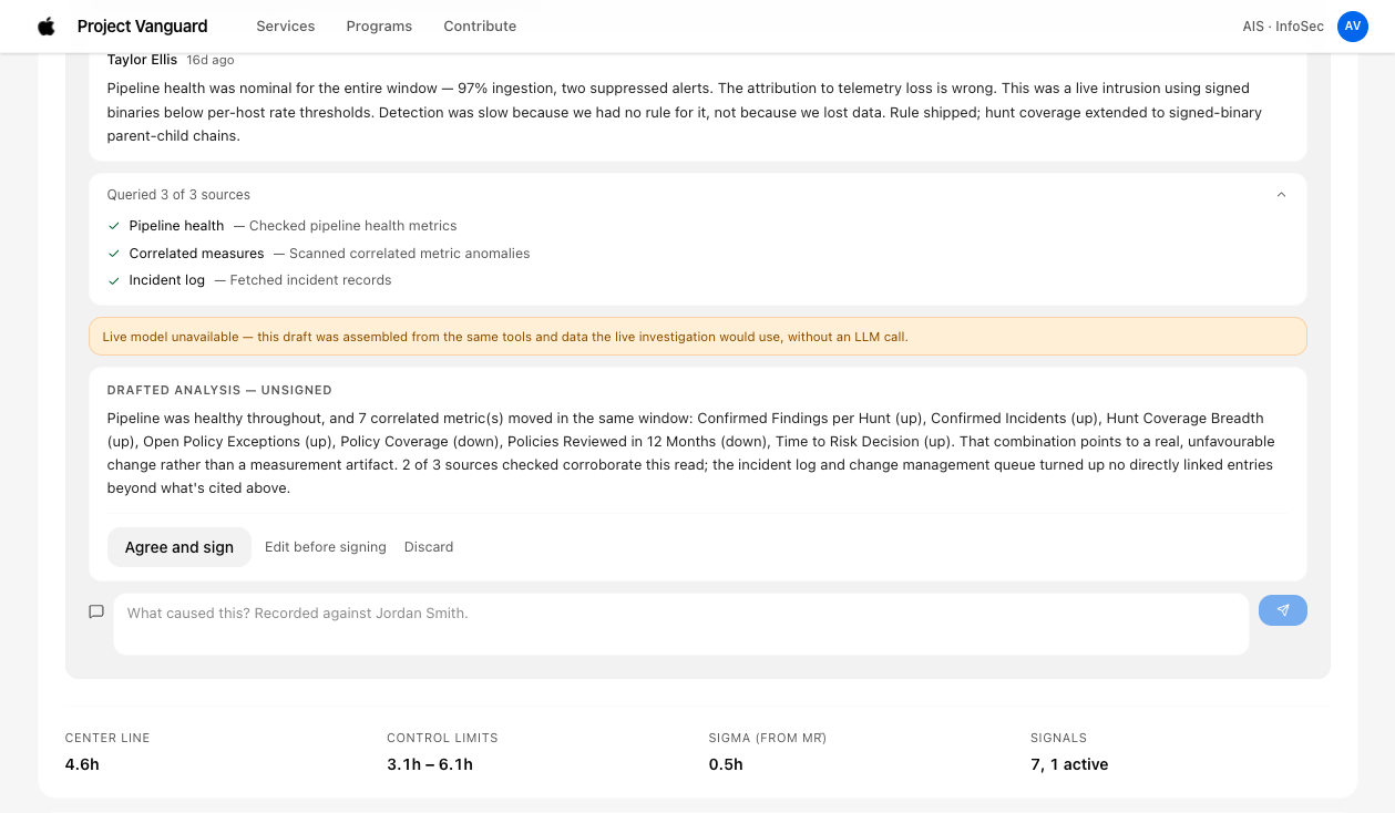
3. AI drafts the analysis. A person owns it.

Detection could be automatic, but every explanation needed an owner. When a measure broke its control limits, an agent drafted the analysis and notified the directly responsible individual (DRI). The DRI edited and approved it before it became the official analysis on the dashboard.

I built this flow as a working prototype in code, including the agent-drafted analysis and the DRI sign-off.

AI Transparency vs Review Bottlenecks

Design Trade-Off: Initially, the team wanted to hide automated analysis unless verified by a human. But the executives wanted to avoid another bottleneck of approval, and insisted on viewing AI analysis as well.

Solution: We showed the AI analysis right away, with a confidence score and its reasoning. Most importantly, I made it obvious whenever someone was looking at automated analysis instead of a signed-off one.

MTTD Anomaly Detection Trigger
01. Trigger — Metric breaks control limits; system flags anomaly immediately.
AI Anomaly Investigation and Confidence Score
02. Agent — AI drafts narrative with explicit reasoning and confidence score.
DRI Sign-Off and Executive Note Publication
03. Sign-off — DRI validates hypothesis and signs off before publishing.
Human-in-the-loop lifecycle: Autonomous detection → Transparent AI analysis → DRI human sign-off.
design

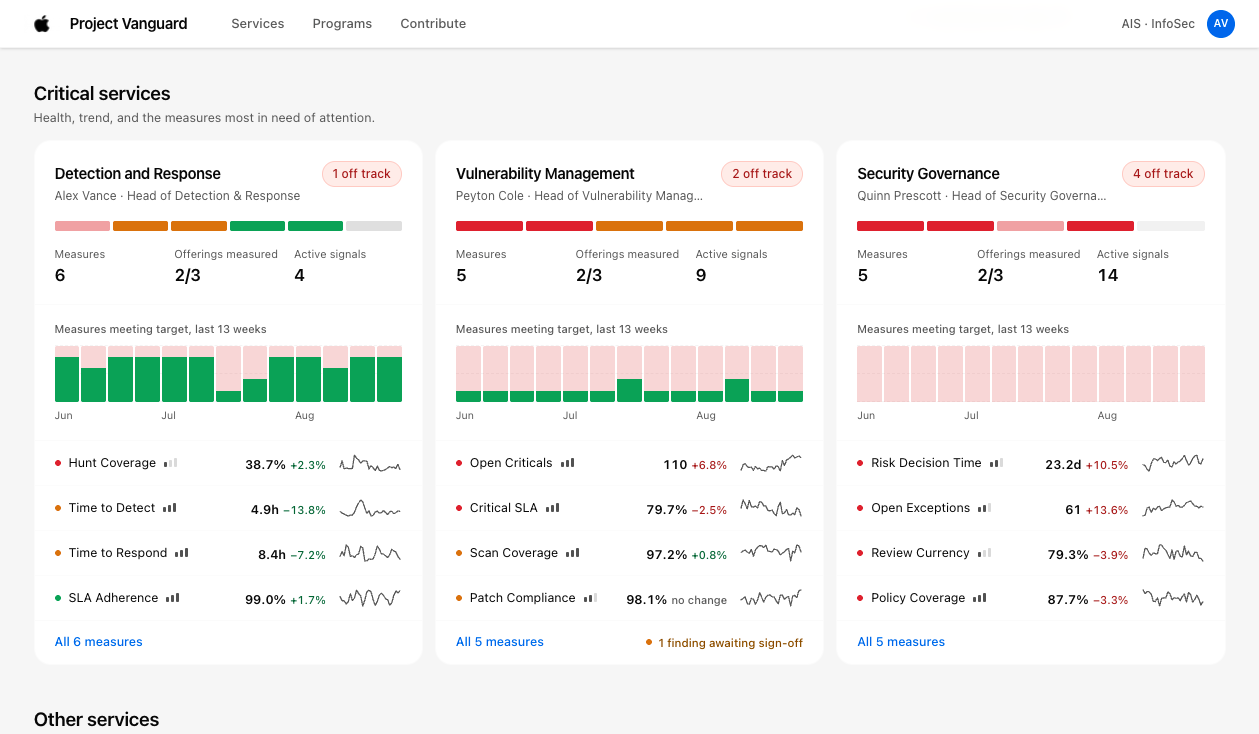
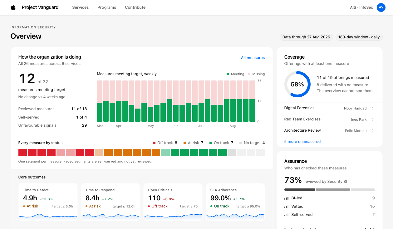
4. The executive surface

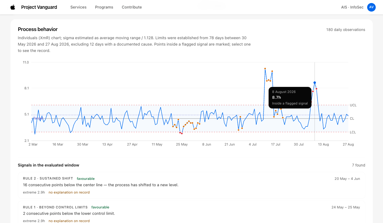
The strategy was to have a single yardstick for every measure. We used a statistical process control (SPC) chart, so we are able to distinguish normal variation from a genuine signal.

This made it easy for executives to avoid reacting to false positives like "we are off our average this week".

Vanguard Executive Surface Overview
Primary executive portal with standardized yardstick metrics
Critical Services View on Executive Homepage
Critical services roll-up utilizing statistical process control
Standardized SPC visual language distinguishing routine telemetry noise from true operational emergencies.
outcome

The IKEA effect

During the pilot, I noticed team leads were excited with their new-found autonomy. They were taking care of it like they own it.

Teams prioritized submitting well-crafted measures for their teams, which in turn made it easy for the BI team to review and approve within days.

BI Coverage

30% → 75%

Achieved in 3 months across partner security teams.

Onboarding

2 mo → 5 days

Average onboarding time reduced via self-service authoring.

Escalations

Cut by >50%

Escalation calls during anomalies cut in half (Survey June 2026).

"Trust doesn't scale through review capacity. It scales when it becomes a visible property of the artifact."

— Product Manager, Apple InfoSec BI Team
Note: I built every screen in this case study in code, as a working prototype. They are representative recreations: names, values, and the project name are fictitious.